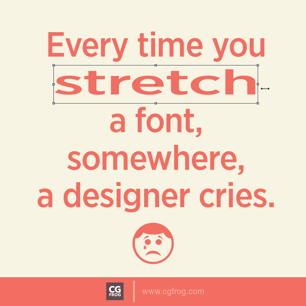
Every time you stretch a font, somewhere, a designer cries
Don’t Stretch Fonts: Being a designer, you need to learn the basics of typography. And use these when designing. Don’t stretch fonts. Or, more properly, don’t stretch fonts to the point where you can see it has been stretched. Trajan is a font that can be stretched quite well without it being obvious. On the other hand, a font with a circular “O” would not stretch well. Designers will obviously notice stretched fonts more than your average Joe Blow, but even if a designer notices it, you haven’t done your job well.
Use of Helvetica Condensed or any wider fonts instead stretch/squeeze. But there is no rule against using them. Sometimes they are the perfect font. And there is a reason they are used so often—they are great, versatile fonts. via : zeven design
Good luck!