10 Typography Rules in Web Design: Either you are a web designer or an entrepreneur, If you are looking to make a website for your business, This video is for you. In this video Logo Design Guru has covered the main 10 rules to help you structure your written content on each web page.
Don’t Miss:
- Typography Principles – 10 Golden Rules to Combining Fonts
- 7 Principles of Typographic Contrast
- The Final Battle-Serif vs Sans Serif
- Emotions Elicited By Different Types Of Fonts
10 Rules of Typography in Web Design:
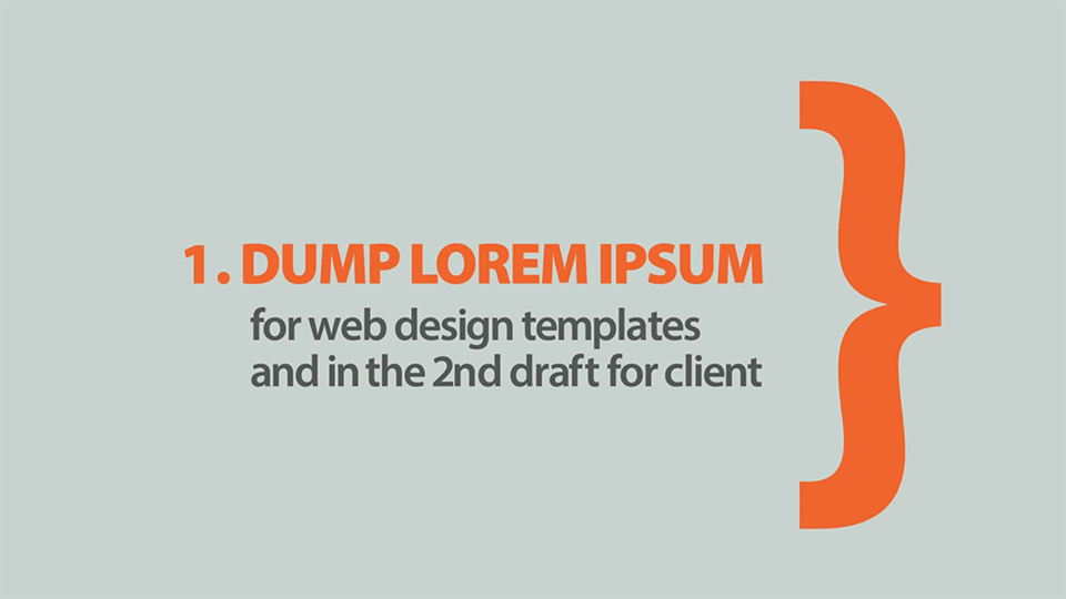
1. Dump Lorem Ipsum
Lorem Ipsum is simply dummy text for web design templates and in the 2nd draft for client.
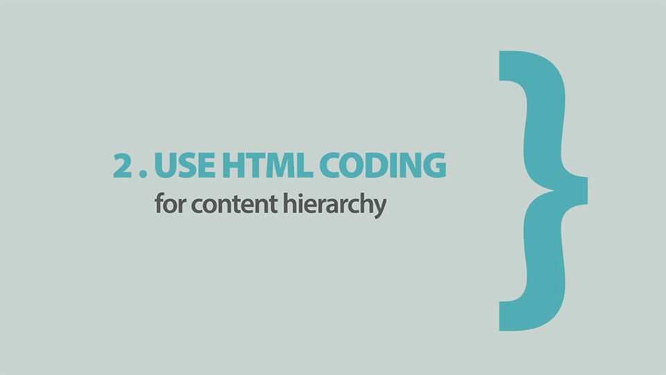
2. Use HTML Coding
Use HTML coding for content hierarchy:
- <h1> has the highest rank and serves as the heading for the entire page. There should be exactly one <h1> tag per page, and since it represents the page as a whole its text is often (but not always) the same as the <title> tag in the document <head>.
- <h2> has the 2nd-highest rank and should be used to denote the various sections of your page. Unlike the <h1> tag, there can be many <h2> tags in the same page (because there can be many sections within a page).
- <h3> has the 3rd-highest rank and can be used to denote sub-sections within page sections. Note that since it represents a sub-section within a page section, an h3 should never be used if it didn’t have an h2 before it (because it doesn’t make sense to have a sub-section without a “parent” section).
- <h4> has the 4th-highest rank and can be used to divide level 3 sections (denoted by h3) into smaller groups. An h4 should never be used if it didn’t have an h3 before it (for example, you should not “skip” down from an h2 to an h4 without there being an h3 in between).
- <h5> and <h6> have the lowest rank, and are very rarely used. If you find yourself with this many levels of content, it probably means there is too much going on for one page. You should consider slitting up the content into several pages to make it easier to navigate.
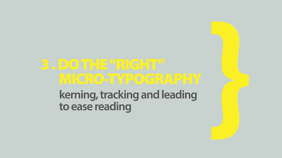
3. Do the Right Micro Typography
Do the “Right” micro typography kerning, tracking an leading to easy reading.
- Kerning which refers to the way specific letter pairs fit together
- Letter Spacing or Tracking both of which mean spacing applied to all letters
- Word Spacing is exactly what it says, the spacing between whole words
- Font Choice can help or hinder attempts at clear communication
- Typographic Errors can sabotage even the best designs
Don’t Miss: 7 Principles of Typographic Contrast
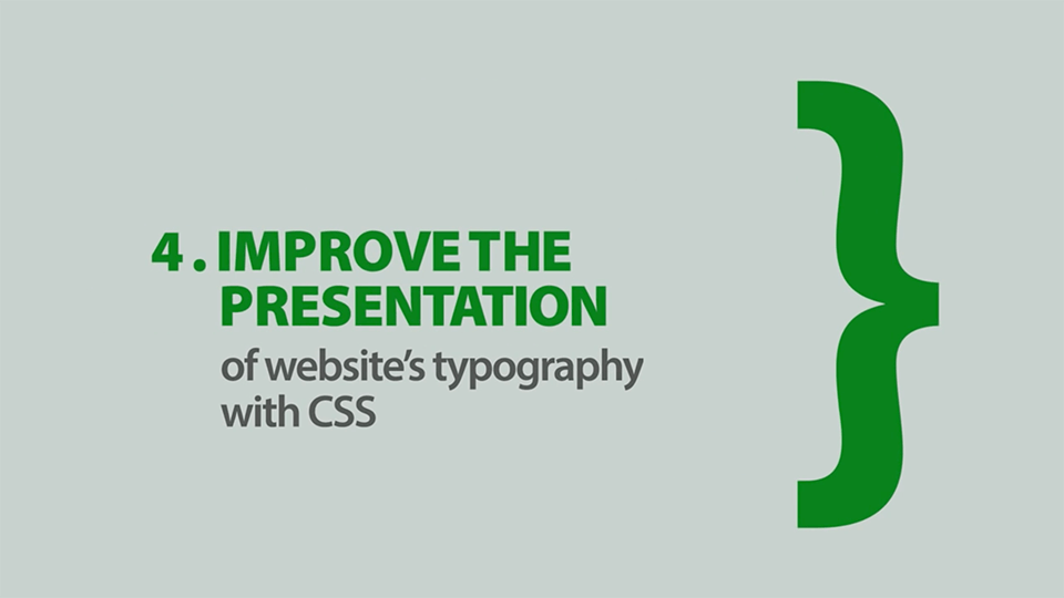
4. Improve The Presentation
Improve the presentation of website’s typography with CSS – Make your website standout with customised typography.
5. Use Responsive Typography
Use responsive typography for responsive web design.
FULL VIDEO: 10 Rules of Typography in Web Design:
Via: Logo Design Guru
We hope you like this post “10 Rules of Typography in Web Design” and learned from it.