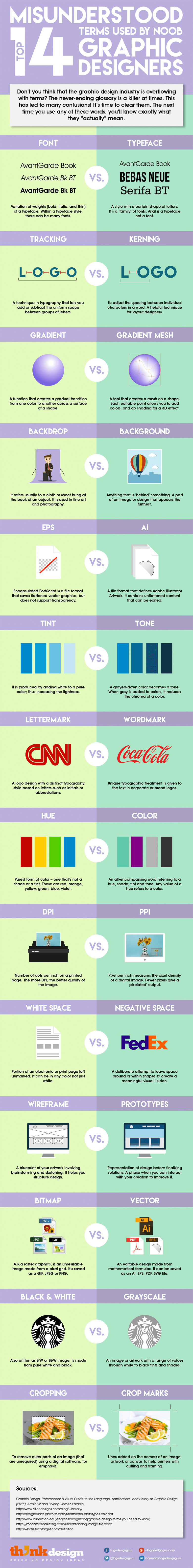
Terms That The Graphic Designers Always Get Wrong: Most of the designers don’t know the important differences between some of the terms we use daily. One of example is font and a typeface. They use the two terms interchangeably. We need to know that the font is the variation of weights (bold, book, italic, thin) of a typeface. A typeface is a family of fonts, like Arial, Gotham, Helvetica, Bebas, etc. Below infographic, help you to remember important differences between some of the terms which we use daily.
Another example is the usage of the terms “tint” and “tone”. Tine is produced by adding white to a pure color; thus increasing the lightness. Whereas, a grayed-down color becomes a “tone”. When gray is added to colors, it reduces the chroma of a color.
Sometimes design speak can get highly technical. ThinkDesign has created this infographic to help you remember important differences between some of the terms we use daily.
14 Terms That The Graphic Designers Always Get Wrong
Hope this post “Terms That The Graphic Designers Always Get Wrong” helps you. If you think of more? Share this post with your the designer friend and voice your views in the comments below.