Best Useful Design Tips: All graphic designers should follow certain rules, and tips that can increase the visual appeal of their graphics. Branding and publishing professional work following the design tips will improve every designer’s output for sure. Poppie Pack who worked as a senior graphic designer at Canva has illustrated 50 beautiful graphics with design tips to make you a better designer.
We’ve selected best 31 out of the lot to share with you all.
This time is to Tweet and click the facebook share button. And leave now MS Paint and Comic Sans for the amateurs – you are designing like a pro now. 😉
Follow these 31 best useful design tips for graphic designers:
1. Use letter spacing and line height to make your text fit your page.

2. Tip: Contrasting typefaces make a great duo.
3. Create strong graphics with the application of saturation and a bold typeface.

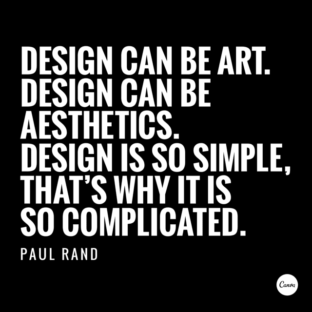
4. Aesthetics! Composition! Adjust all the elements in your graphic so they are on corresponding angles.
5. Crop images to let them act as background textures.


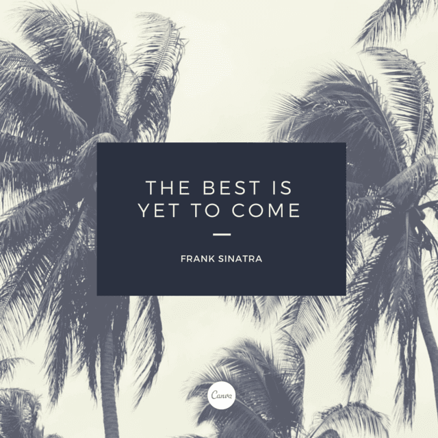
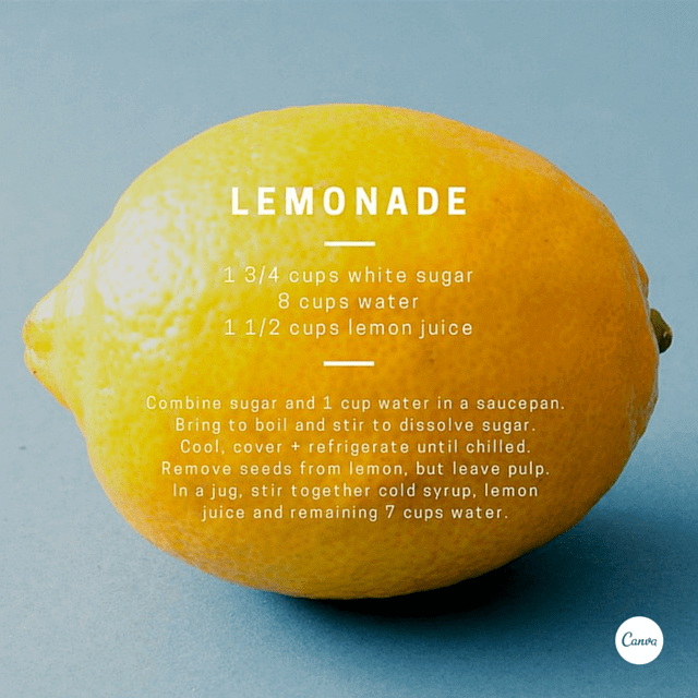
6. Let your background determine how you align your text. Find space with less noise for placement.

7. Use strong, geometric typefaces to amplify your message.

8. Instead of using solid colors, try increasing the transparency of your elements a little for a more subtle effect.
9. Use shapes to create contrast and offset your text from your background image.
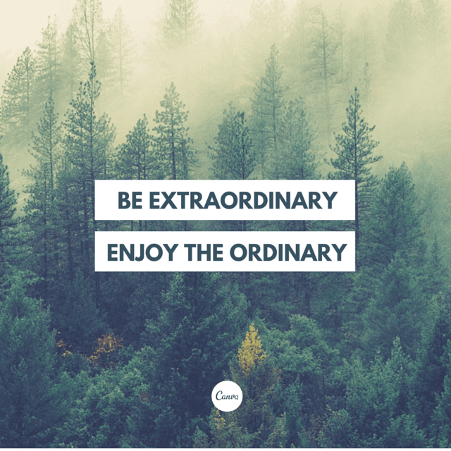
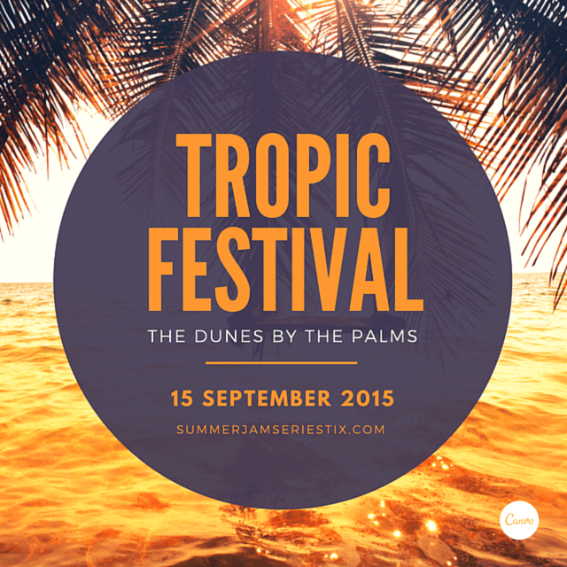
10. When using a shape to contain your text, apply a color from your background to your type for a cut-out effect.
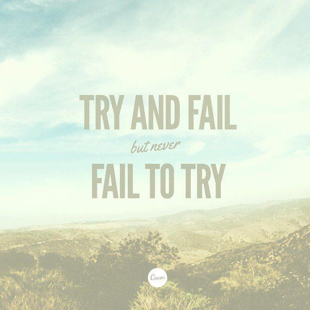
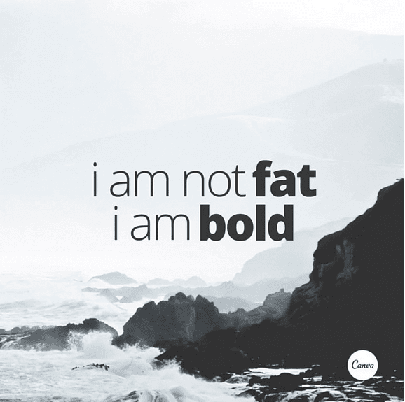
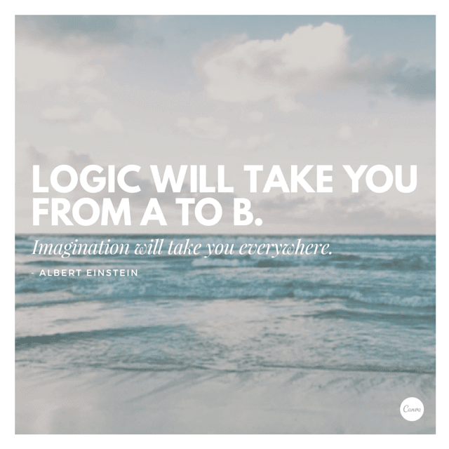
11. Use light and bold font variants for emphasis and impact.

12. Use the combination of a tint and x-process to create two-tone filter effects.
13. Typefaces have personalities too. Make sure you represent your message with the right fonts.
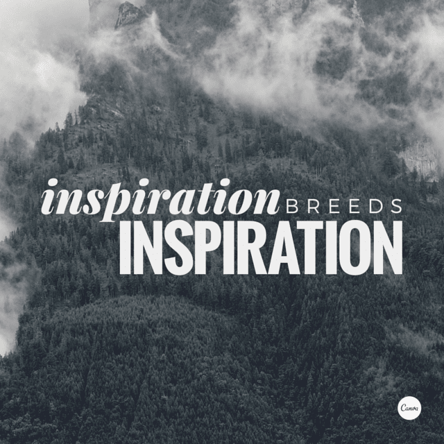
14. Use different fonts on the same words and see how their tone differs.
15. Enhance the freshness of dull images by increasing the brightness in your filter panel.
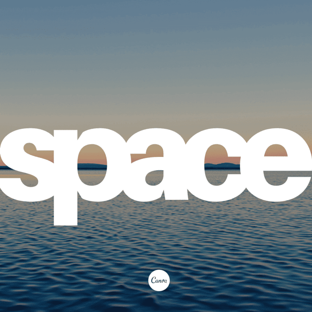
16. Use an interesting text placement to play on the idea of your message.
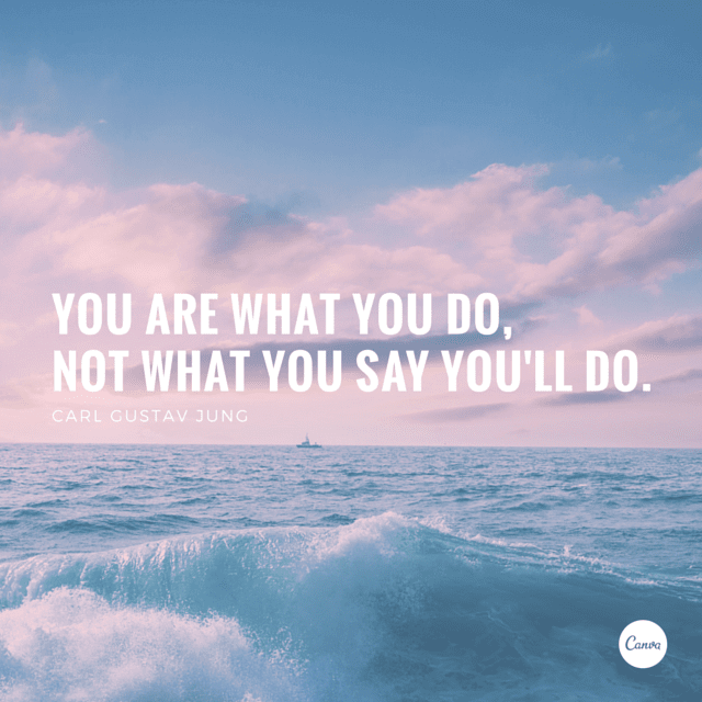
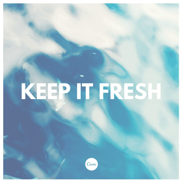
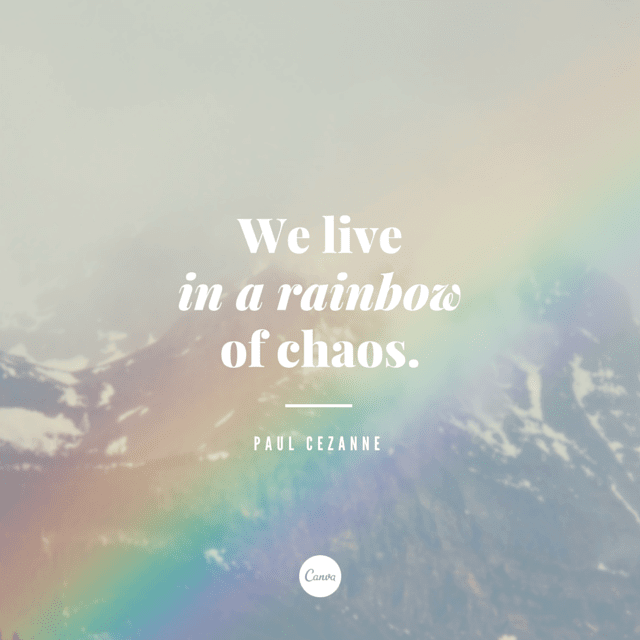
17. Use a low contrast background combined with bright text to make your message stand out.

18. Treat content with a strong rhythm with an equally strong design style.
19. Use a bold and stylistic typeface teamed with a fine sans serif for optimum contrast.
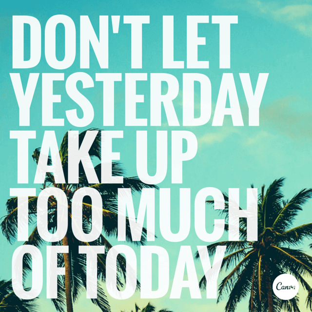
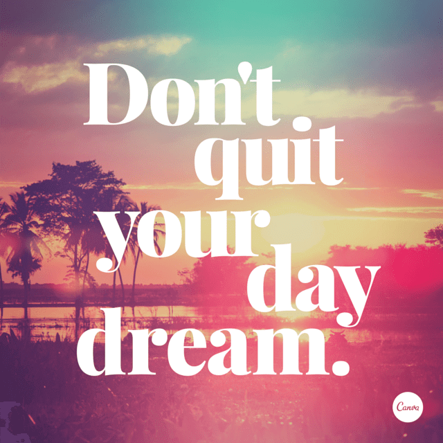
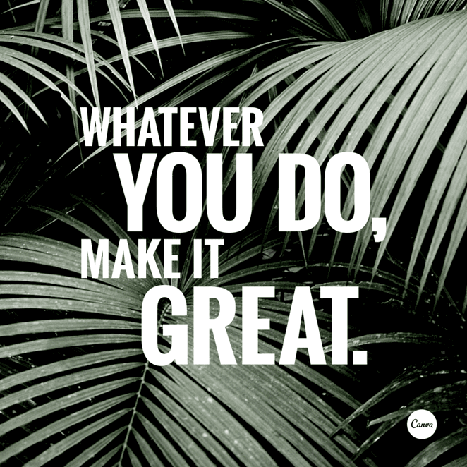
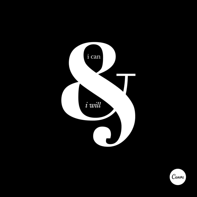
20. Use scale as a visual element to place emphasis on words.
21. Use shapes to create symbolism that reinforces a message in your graphic.

22. Apply a tint to your image the same as any block color in your design for consistency.

23. Create beautiful typographic forms by increasing or decreasing letter spacing.
24. Use colors from your background image to apply to your text.
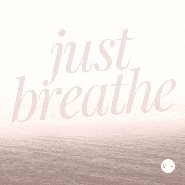
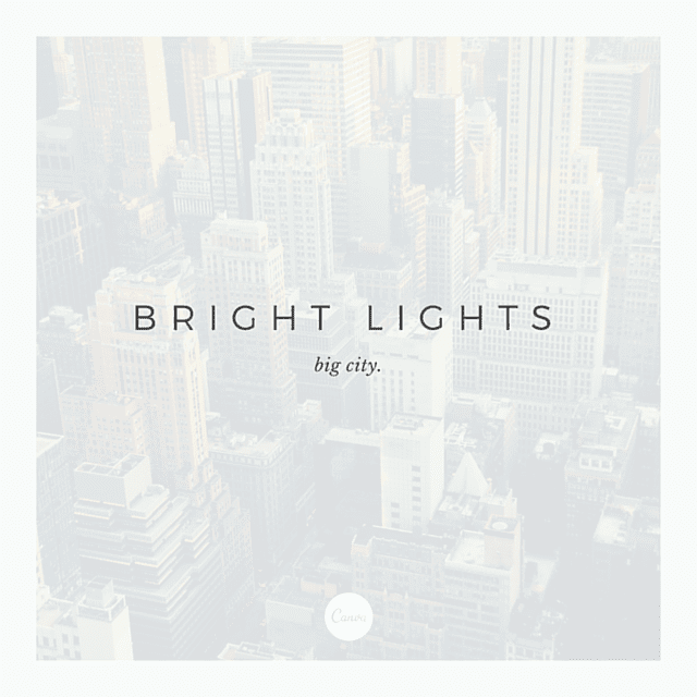
25. Create calming, cool design using soft tones and transparent imagery.
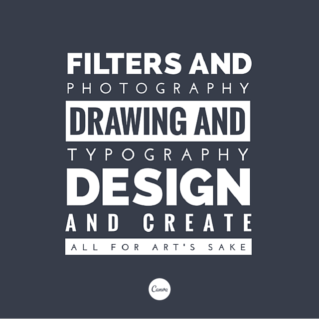
26. Push your creative skills by stacking different weight typefaces for a stylised effect.
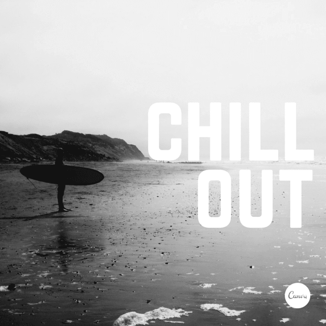
27. Monochromatic style graphics never get old. Use black and white filters combined with white text for an epic contrast effect.
28. Create clever compositions by letting the features within images guide where to place your type.
29. Contain your content by using a frame around your text.

30. Be creative with letters + symbols by applying scale to form interesting compositions.
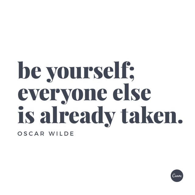
31. Never underestimate the power of a nice image and clean text.
Conclusion
Design tips are a result of great practice. These tips are explored over a period of time and not learned from any curriculum. So, be it design tips for beginners or some design tips for professionals; these tips will contribute a great deal to improve your designing skills. Do let us know which one is your favorite out of these design tips.
It’s time to Tweet and click the Facebook share button. Do leave MS Paint and Comic Sans for the amateurs – you are a pro designer after all!! 😉