Elements of Bad Typography: Just like Good Typography is all around us, the Same thing with Bad Typography which is also everywhere. When looking at the typographic design, there are 5 elements of bad typography where you can potentially go wrong. Any one of these, if not handled properly, can create confusion where there should be none.
Related articles :
- Typography Principles – 10 Golden Rules to Combining Fonts
- Typography Tips: 10 Rules of Typography in Web Design
- Top 5 The Most Common Mistakes Made By Designers
- Contrast in King : 7 Principles of Typographic Contrast
- Font Moods: Emotions Elicited By Different Types Of Fonts!
These are 5 Elements of Bad Typography:
1. Kerning


Kerning which refers to the way specific letter pairs fit together
2. Letter Spacing or Tracking
![]()
Letter Spacing or Tracking both of which mean spacing applied to all letters
3. Word Spacing
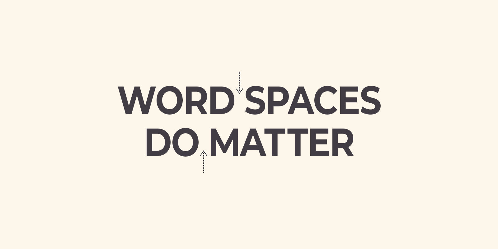
Word Spacing is exactly what it says, the spacing between whole words
4. Font Choice
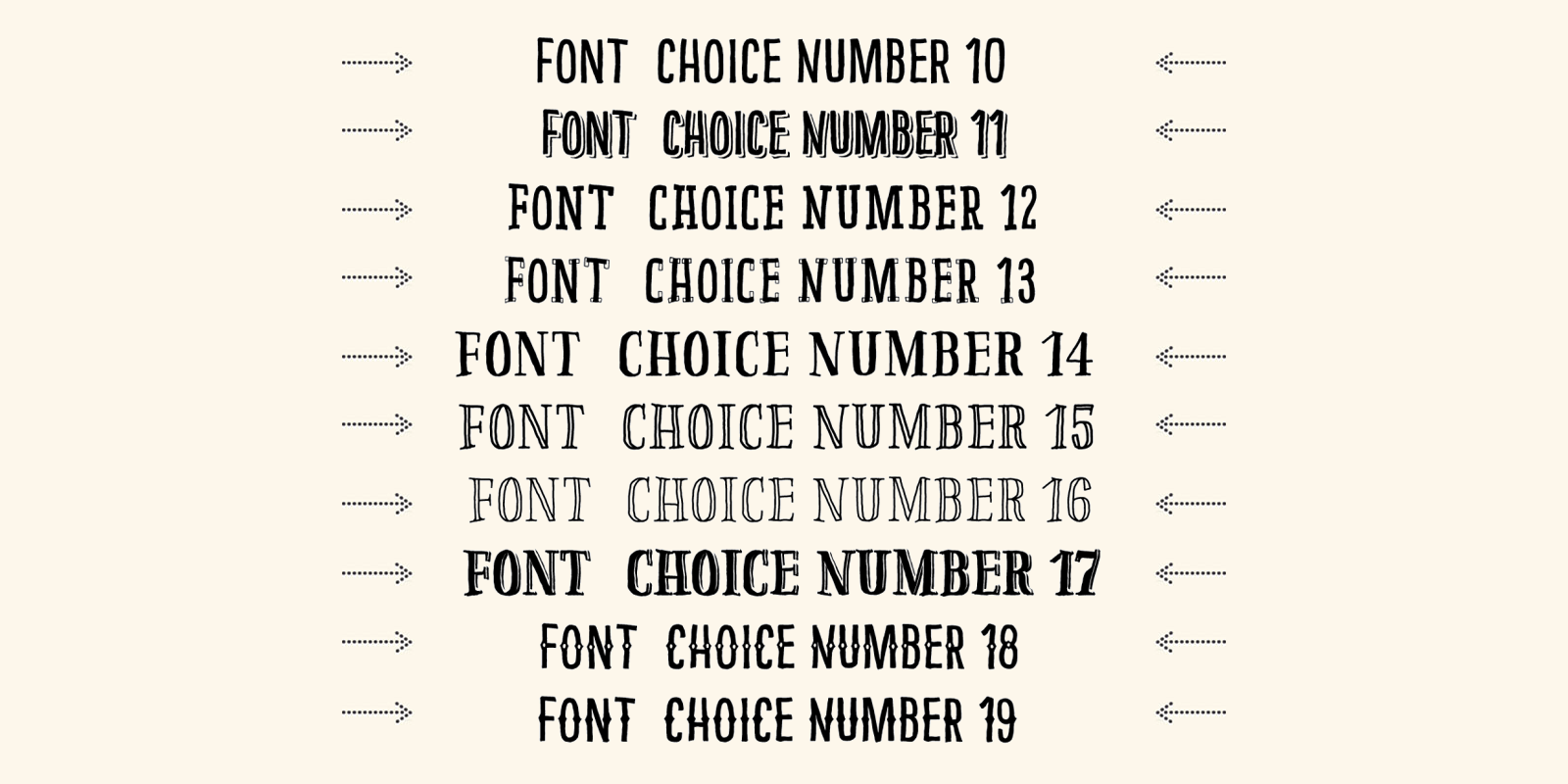
Font Choice can help or hinder attempts at clear communication. Read: Top 10 Font combinations golden rules a designer to follow for typography designing.
5. Typographic Errors
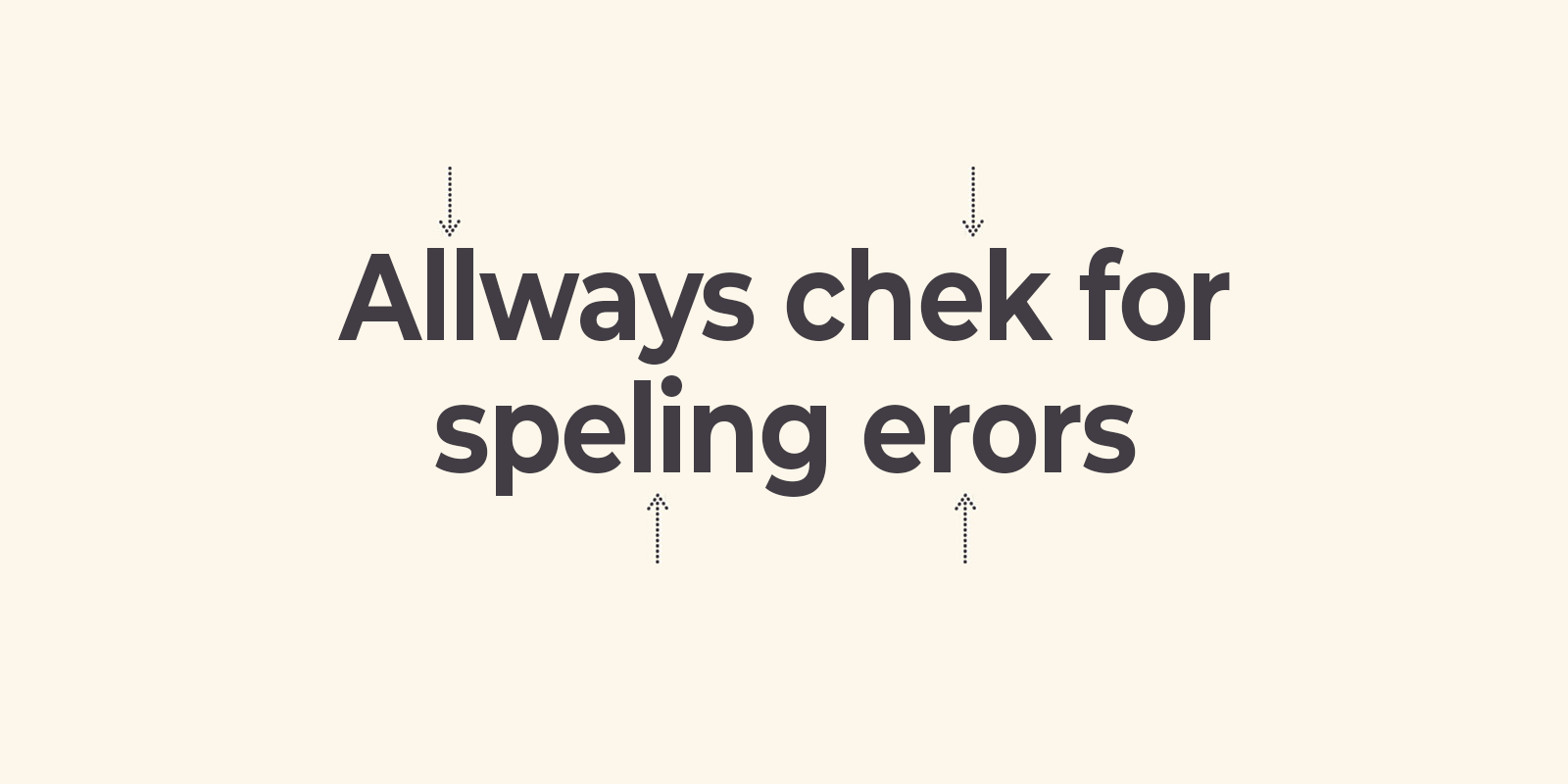
Typographic Errors can sabotage even the best designs. This is the greatest nightmare of a designer. We don’t expect you to be a pro but at least try to avoid the silly mistakes.
Don’t Miss: 17 Habits of a Bad Graphic Designer
See Below The Result If You Make Something With Bad Typography:
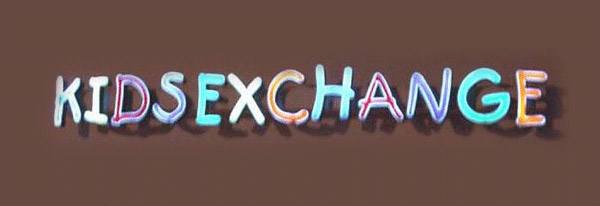
Bad Typography Examples In the World
This is “KIDS EXCHANGES” but you read “KIDSEXCHANGE”.

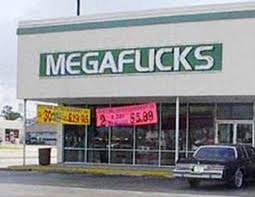
This is “MEGAFLICKS” but you read “MEGAFUCKS”

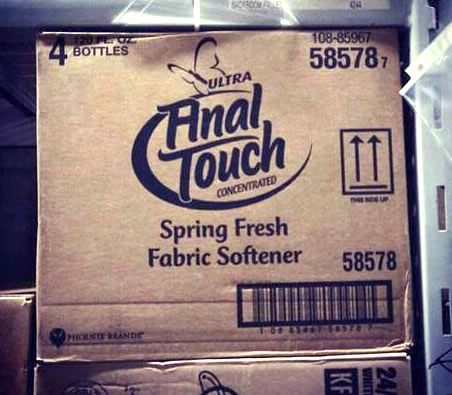
These are examples of bad word spacing. At a glance, what does this store sign seem to say?
Another example of Bad typography

This is “BUY 1, GET 1 50% OFF”, But you read “BUY 1, GET 150% OFF”


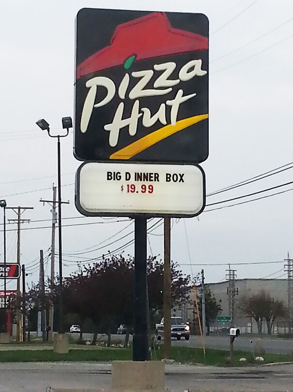
This is “BIG DINNER BOX”, But you read “BIG D INNER BOX”

This is “MASSAGE THERAPIST”, But you read “MASSAGE THE RAPIST”