Yes, We’re talking about a bad graphic designer and their bad design techniques. But we’re not here to criticize anybody or to find faults. Our sole aim of compiling this list of habits of a bad graphic designer is to give an insight of the common mistakes that you might be doing while designing. Read this, 5 Elements of Bad Typography That Designer Should Avoid
Every designer at some point in his life must’ve been into following some of these bad habits. The reason could be a lack of knowledge, lack of creativity and skill, lack of patience where the designer might just overlook these mistakes. Read this, 18 Rules for Using Text for Designing
We just hope that you take this positively and try to improve as a designer. After all, we’re here to guide you through your journey as a designer. Please be aware of the fact that none of these are rules as such, it is more like a general guide to make you an expert designer! Read this, Top 5 The Most Common Mistakes Made By Designers
Habits of a Bad Graphic Designer
1. Poor Typography Choice
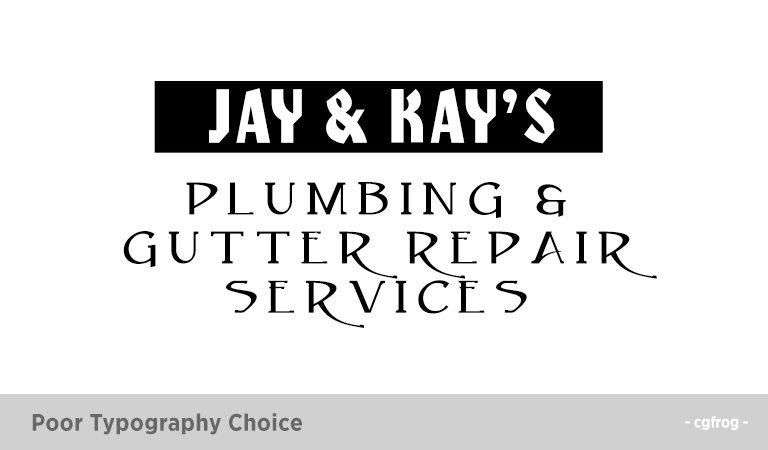
If the matter wrote on a signboard or a creative is not legible, the whole design goes in vain. This may result in a failure in the project. Some of the poor choices of Typography may be a result of using too many different types of fonts, using the type that is too complicated or the one that does not go with the content. Read this, 10 Golden Rules to Pairing Fonts
2. Use of Helvetica
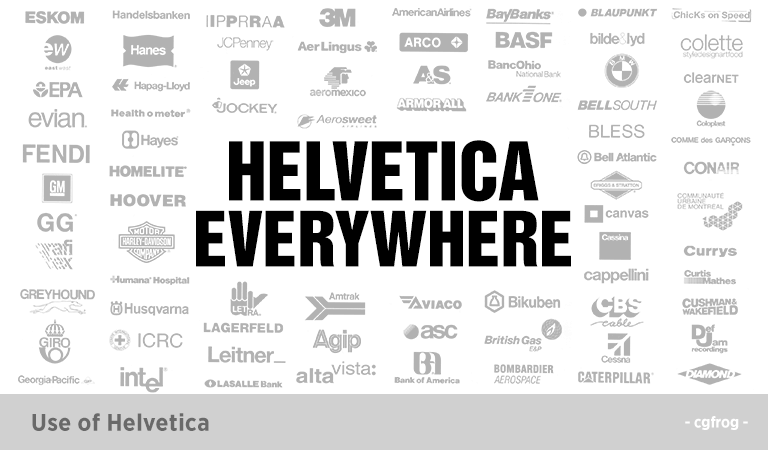
Designers are fond of this font style since ages but now it is the time to experiment with some new fonts. There are infinite options available to choose from. Fonts like Avenir, Gotham, Roboto etc. May be used. Break the stereotype and be open to trying something else. Every font has its own mood Font Moods: Emotions Elicited By Different Types Of Fonts!
3. Grammar and Spelling Errors
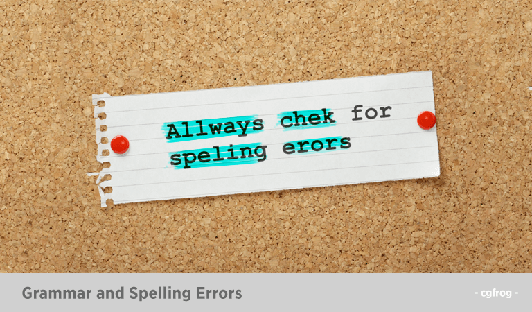
This is the greatest nightmare of a designer. We don’t expect you to be a pro but at least try to avoid the silly mistakes.
4. Underline
Do you underline stuff in your designs? Take it easy my fellow designers. It is a rule not to use the underline feature in the design. Let the hyperlinks have the sole right to use it.
5. Forgetting to Kern
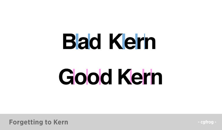
Kern refers to adjusting the spacing between the characters. So when a designer forgets to Kern the design may look like the one prepared by an amateur. This may also make the project look incomplete.
6. Proofreading
The more errors you make in your design, the worst it is going to be. It is highly unprofessional to send a copy of the design to the client which is full of errors and not proofread well. This might also lead to the client never coming back to you. Be careful designers!
7. Using Hyphens For Bullets
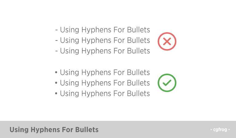
Using hyphens for is an age-old habit and unprofessional. Try using dots or other modern and up to date technique. Upgradation is for the better after all.
8. Borders
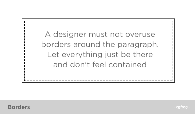
A designer must not overuse borders around the paragraph. Let everything just be there and don’t feel contained.
9. Too Much Color
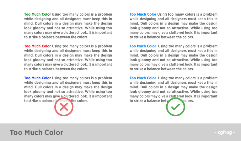
Using too many colors is a problem while designing and all designers must keep this in mind. Dull colors in a design may make the design look gloomy and not so attractive. While using too many colors may give a cluttered look. It is important to strike a balance between the colors. Go with minimal.
10. Hit Twice Enter/Return Key
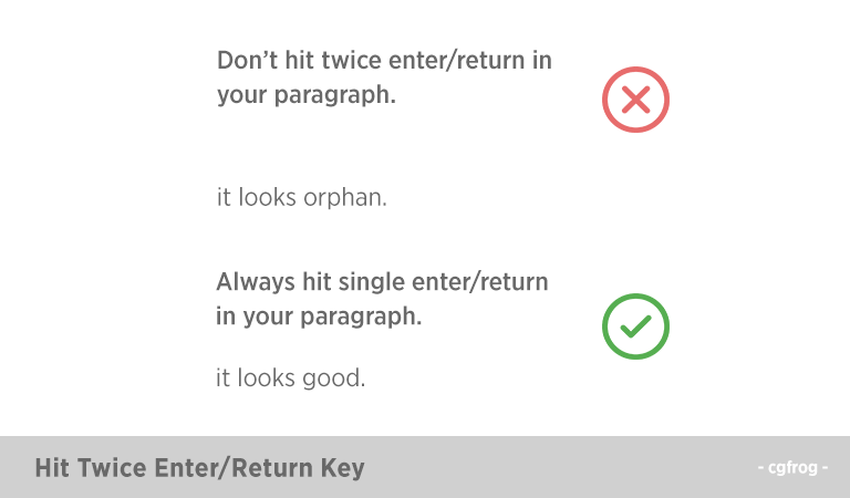
Don’t create double space by hitting ‘enter key’ (Windows) or the ‘return’ key (Mac) twice between paragraphs or after headlines.Creating double space between the paragraphs or after headings end up in creating a blank line at the top of the column. It also leaves a lot of space between each paragraph. It looks orphan.
11. Poor Color Choices and Using Gradient
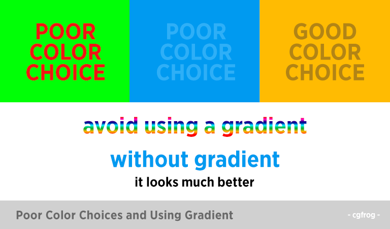
In order to increase the readability of the text, it is important to choose a right background color for the background and for the text as well.
A common mistake, often ignored by the designers is the use of similar tone both for the text as well as for the background.
This reminds me of my childhood days when I used to play with tools and try gradients on my text. Grow up, designers. If you are using smaller text, avoid using a gradient, especially rainbow gradient. Read this, 7 Principles of Typographic Contrast.
12. Fear of White Space
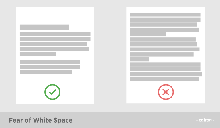
Not using all the available space appropriately is also a habit of a bad graphic designer. A good designer places all the elements in a graphics well and makes the best use of the available white space.
13. Type Scaling
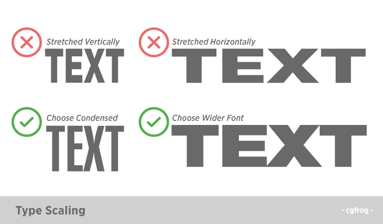
Type stretch is where you can select a normal, condensed or expanded forms of text. Instead of stretching it vertically or horizontally, you should use condensed or wider looking font. See: Every time you stretch a font, somewhere, a designer cries
14. Using Incorrect Quotes
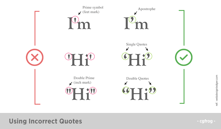
Try to use the correct kinds of the quotation mark in your creations. Using curly quotes instead of straight and vice versa is like making a blunder. Also ignoring the use of quotes is a common mistake that the designers make.
15. Text Stroke
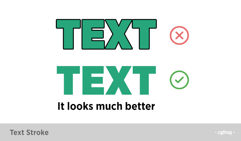
Avoid using outlined text. The text becomes illegible. Just keep it simple.
16. Incorrect Punctuation
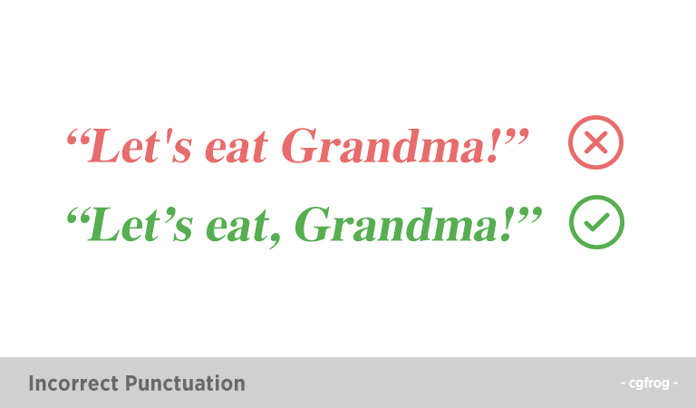
Punctuations are though small creatures but hold a lot of importance. Using incorrect punctuations often change the meaning of a sentence. Thus, designers must be extra careful while using them.
“Let’s eat, Grandma!”
“Let’s eat Grandma!”
Didn’t we tell you that punctuations are important!
17. Embossing
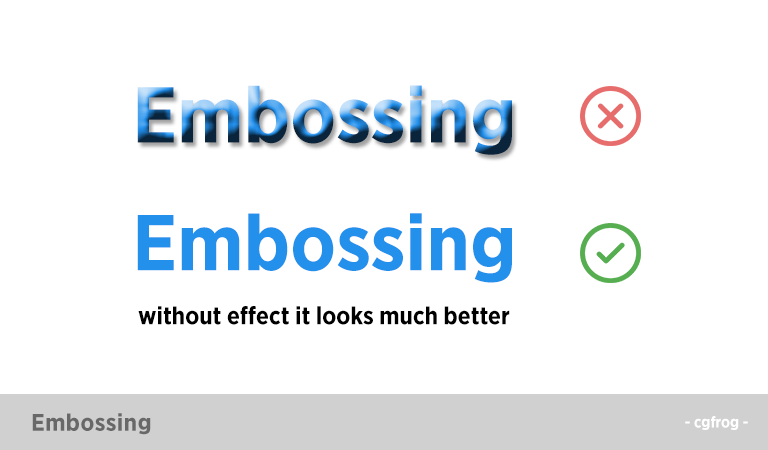
Embossing text makes it look very messy and unreadable. And if you add a drop shadow to it, it is a total amateur thing. Keep it simple and plain.
Final Words
Bad habits can ruin your name, your career and also your chances of getting business. When people see a perfectionist on the job they tend to trust you more with the job. It is important for a designer to overcome these bad habits and step towards getting the best.
Less is more!!