The video content overload on the internet has received the biggest makeover since its inception in the year 2005. YouTube’s logo evolution is receiving all the attention throughout the world.
Earlier, all the YouTube logos have boxes with the word ‘Tube’ in a red screen. This depicts a Tube which is an informal word representing a television. However, YouTube’s use is spread across the world on all types of screens with an internet connection.
YouTube Old Logo:
![]()

The new YouTube logo highlights the play button. This play button looks good in front of its name. This logo follows some brand guidelines and is crisp, neat and a very tidy logo. This also clearly specifies how this logo looks on different backgrounds.
YouTube New Logo
![]()
Google says: “The bright red cherry on top of this update sundae is a refreshed YouTube Logo and YouTube Icon.”
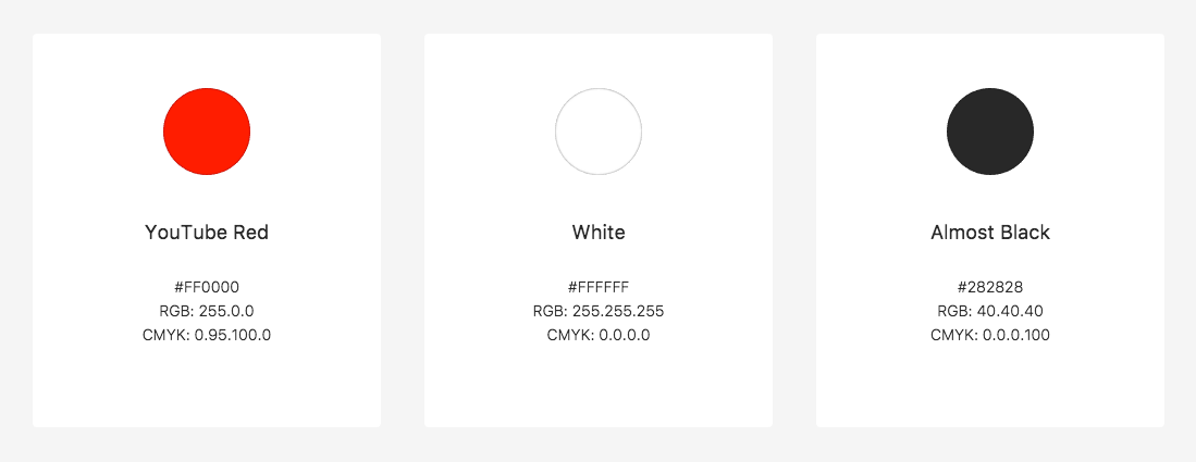
YouTube colors:

Logo evolution is something that the companies resort to after few functional years to upgrade and also to give a new and fresh look to their company’s visual appearance. While there are some other famous evolutions also in the history but this one is really special for all of us.
This is the biggest makeover that the YouTube logo has ever received in its lifetime. The earlier changes were, however, very minor. Check out the image below which shows the overall YouTube logo evolution.
YouTube Logo Evolution:
![]()


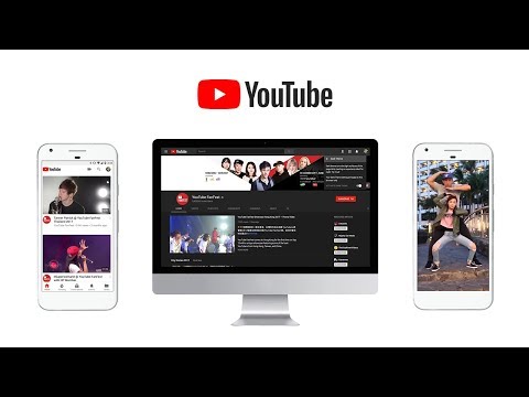
The introduction of the new logo and the brand new icon are an integral part of the changes along with the new features to the internet giant. The big news is that Youtube is no longer a singular website supporting video, but it has brought in a whole new range of different apps that can span across various platforms. This is definitely a plus for all music junkies.

“… We’ll bring a new level of functionality and a more consistent look across our desktop and mobile experiences,” said Neal Mohan YouTube’s Chief Product Officer.
YouTube is also bringing in new features and experimenting with a brand new approach to mobile browsing. The team is striving hard to find new gestures. These gestures can resonate with their audience in the best and the most convenient way. The team says that they are trying to create a common language across all their apps. The main aim of the team is to make it feel more human.
Your Opinion
[zombify_post]