Established in 1966 (as Interbank until 1968 and later known as Master Charge until 1979),
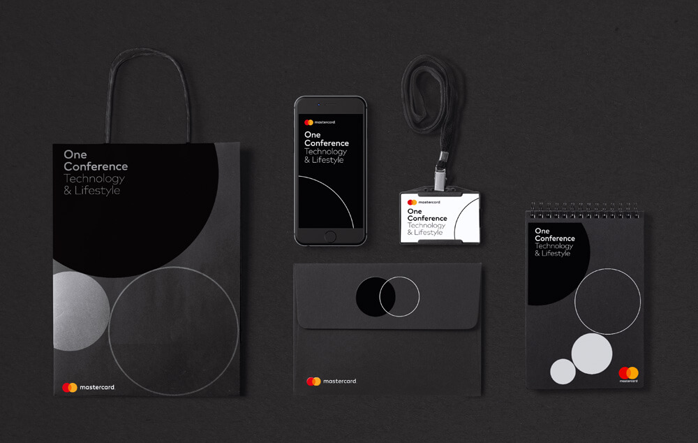
Mastercard has introduced a new logo – the first change in 20 years — and identity designed by New York, NY-based Pentagram partner Michael Bierut (and team).
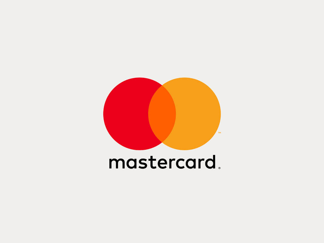
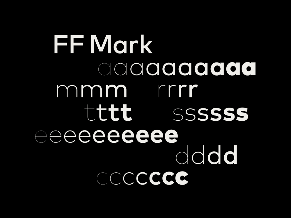
MasterCard’s new logo retains its renowned interlocking circles in red and yellow. The brand name, however, has been moved to the circles’ exterior in font ‘FF Mark’–selected for its contemporary look plus great readability in small sizes–and is now in lowercase. This increases the logo’s flexibility, allowing it to be easily interpreted horizontally and vertically.
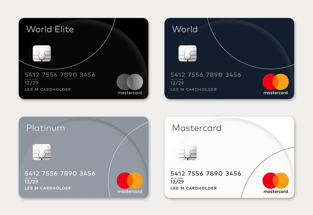
The fresh look that was introduced on 14 July 2016 is set to roll out in conjunction with the company’s new secure digital payment system ‘Masterpass’. Checkout our other post : The Evolution of Top Famous Company Logos
Via designtaxy