Buttons are one of the most essential components of any user interface design. Attractive button design is useful and essential to trigger click or even sales for any company. These buttons also lead the users smoothly through the website or mobile app. Owing to the attraction that a button adds to any page, special attention is paid to design these buttons with great care whether these buttons are on a simple app or whether we talk of web button designs. There are many principles, tips and tricks to design a perfect button. This article will give you an insight into all essentials that a designer must know for button design or web button design for that matter. This article will also focus on button design ideas and button design inspiration to help you create unique and effective buttons.
Further Reading on CGfrog
- Google Launched New Material Design Tools for Designers/Developers
- Infographics: What is UX?
- Flat Design Icons Sets for Designers
- 7 Killer Tips to Becoming a Kickass Logo Designer
- 10+ Logo Design Books Every Designer Must Read
What is a Button?
The term ‘button’, also known as the push or the command button is a graphical representation of a control which paves a way for the user to set off a command or an event. This may include options like search, Confirm button etc. The sole aim of creating a button is performing an action fast at just a click. Buttons are a common element of an interaction design.
1. A Button Anatomy
Creating buttons for an app or a website is like creating assets for them, which is often a procedural process. A button is made-up of three main components, which are:
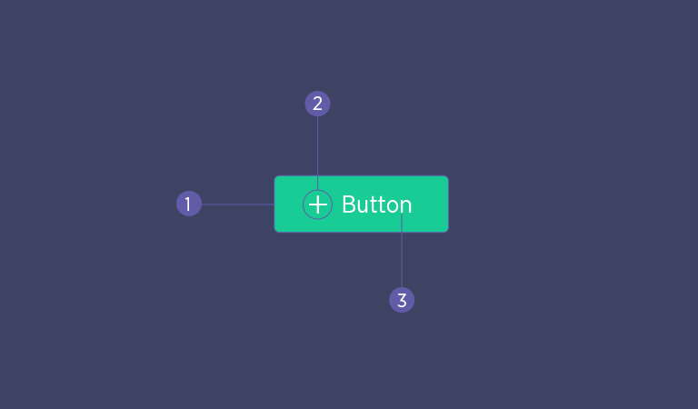
- Container
- Icon
- Text Label
2. The Shape of a Button
A button should look like a button!
The most common question that every designer asks is regarding the shape of a button.
A button is typically rectangular in shape. In some cases, it is also round. However, there is no thumb rule as such. But what is important is that being a designer, you should be able to make a button look like a button. Buttons are simple with just one word written on them, but they may also be descriptive in some cases. By clicking on these buttons using a mouse pointer, the action written on the button can be performed. One can be super creative while creating a button, but the only thing to keep in mind is that a user should be able to identify each button well. A safe bet is though to make buttons square or square with rounded corners. The button design largely depends on the kind or type of the app or website also. The most commonly used and most familiar button shape is – rectangle.
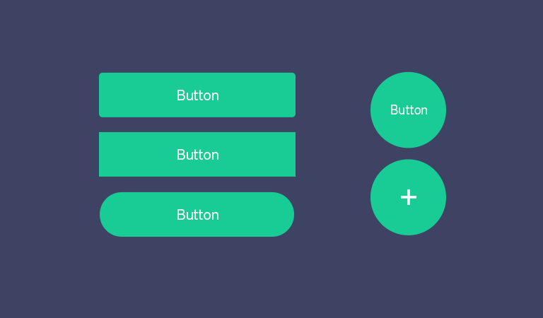
It is important to have visual identifiability of buttons so that users understand that a particular element is a button. This will increase the clickability of it. Irrespective of the shape of the button, a designer must keep in mind that all buttons in a particular UI should be uniform and look alike.
3. Common Uses of Buttons
The following are the uses of a button:
- Buttons often change graphically and look like a mechanical button.
- For some buttons, we have to click just once to finish an action.
- We have to click some buttons more than once to achieve the desired result.
- A button also shows a tooltip when we move the pointer on the button.
4. Common Attributes of a Button
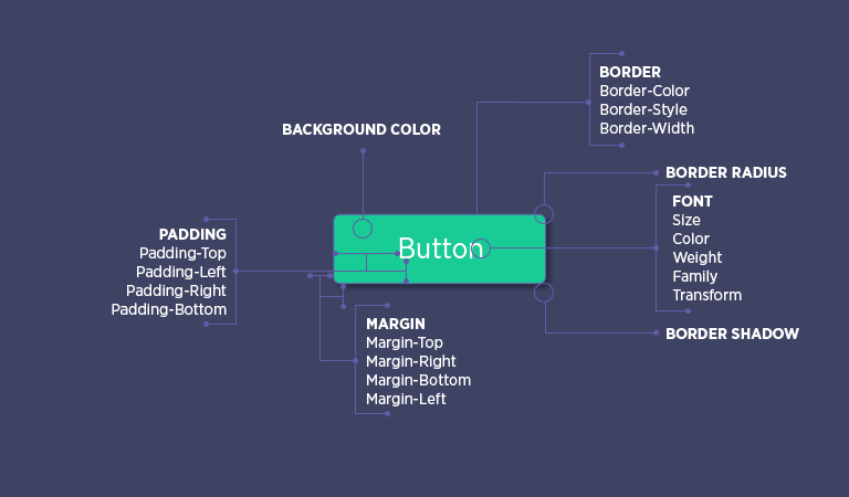
Buttons stand for the action that it performs as a part of the UI. They are the common and the simplest element of interaction between the user and the UI. Though they look like the simplest element, they are packed with numerous attributes. These attributes include the margin, the padding, the border, the border radius, the font style, font size etc. The following picture depicts the common attributes of a button.
Some Common Examples of a Button Are:
OK button – Confirms an action and closes the current window.
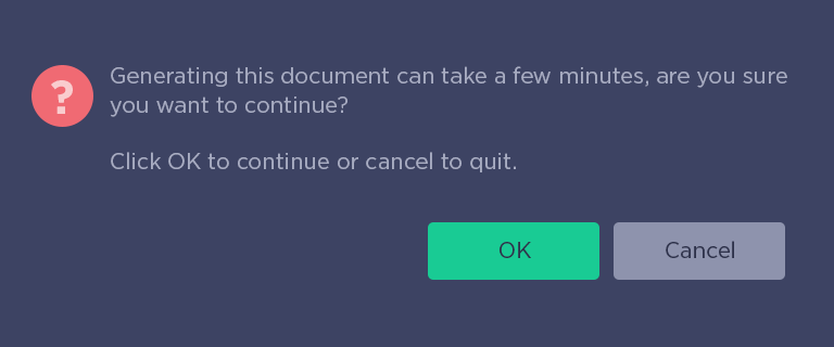
Cancel button – Cancels an action and closes the current window.
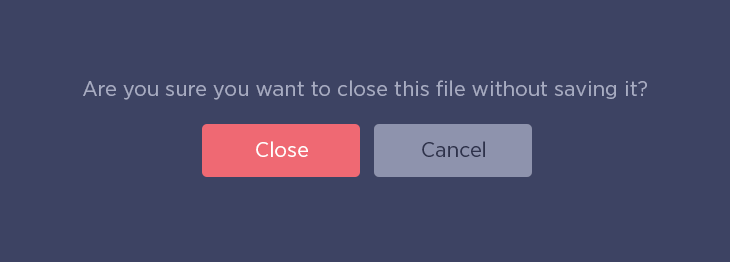
Close button – Closes a window after finishing the action performed.
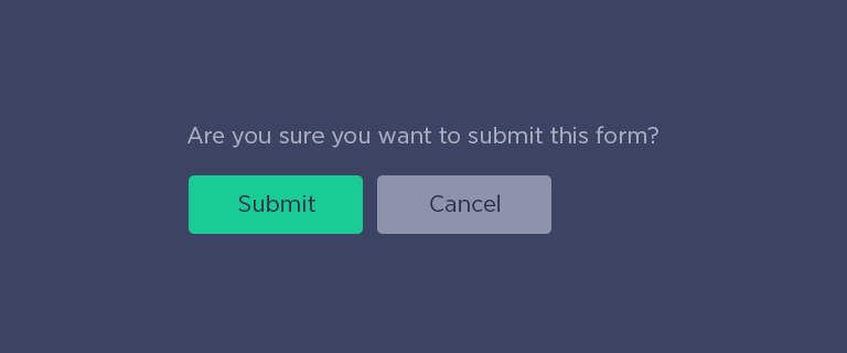
Submit button – Submits a form or application after all the required fields are fulfilled.
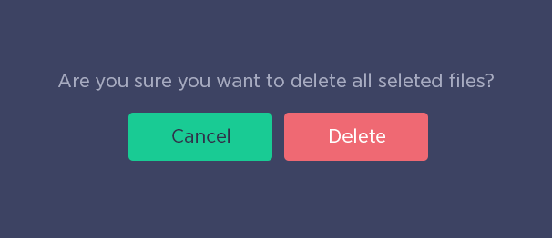
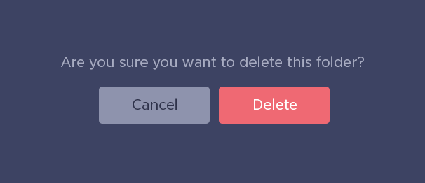
Delete button – This button enables one to remove any unwanted files or folders.
Tips for Successful Button Design
1. Button Shape and Designs
Use familiar designs for your buttons
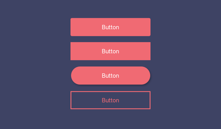
The shape of a button is important as a button should be easily recognizable and not get merged with the background. A user actually has to make a lot of efforts to decode a button. Here are a few examples of buttons that are familiar to most users:
Among all those examples, the “Filled button with shadows” design is the clearest for users. When users see a dimensionality of an object, they instantly know that it’s something they can press.
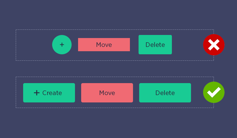
2. Design Consistency
A designer should keep in mind the consistency of a button while designing one. The button design should be according to the User Interface and should be in a similar theme.
3. Drop Shadow and Highlights
Shadows are important hints that a designer gives to the users which help them identify the clickable objects on a screen. If a button casts a shadow, the user tends to understand that it is an interactive element on the page. This shadow also gives a raised look to the button which makes it distinguishable.
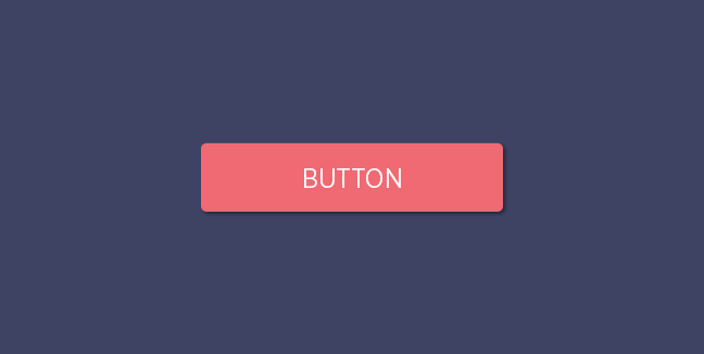
If a button casts a subtle shadow, users tend to understand that the element is interactive.
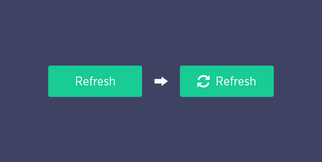
4. Use the Icon to Label Buttons
The user should be able to judge looking at the button as to what function it will perform. This also makes the button identifiable and the user can spot it at a glance. The icon on the button also tells the user about the function it will perform.
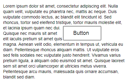
5. Size and Padding
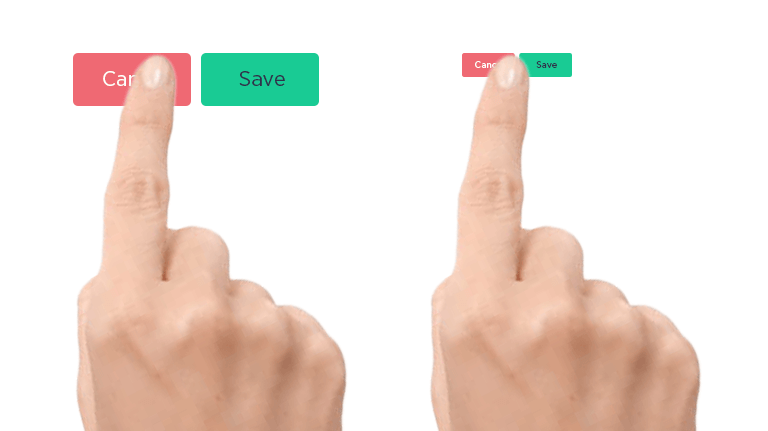
A button smaller than a finger will not be clickable. So, it is important to decide the right size and the correct finger pad size should be followed. But, when a user uses a mouse, the size of these buttons can be slightly reduced.
6. Don’t Forget About the Whitespace.
The designer must keep in mind the whitespace on the screen. When the user sees the dimensionality of an object, they instantly think that this element is clickable, Thus, a button design should be done carefully.
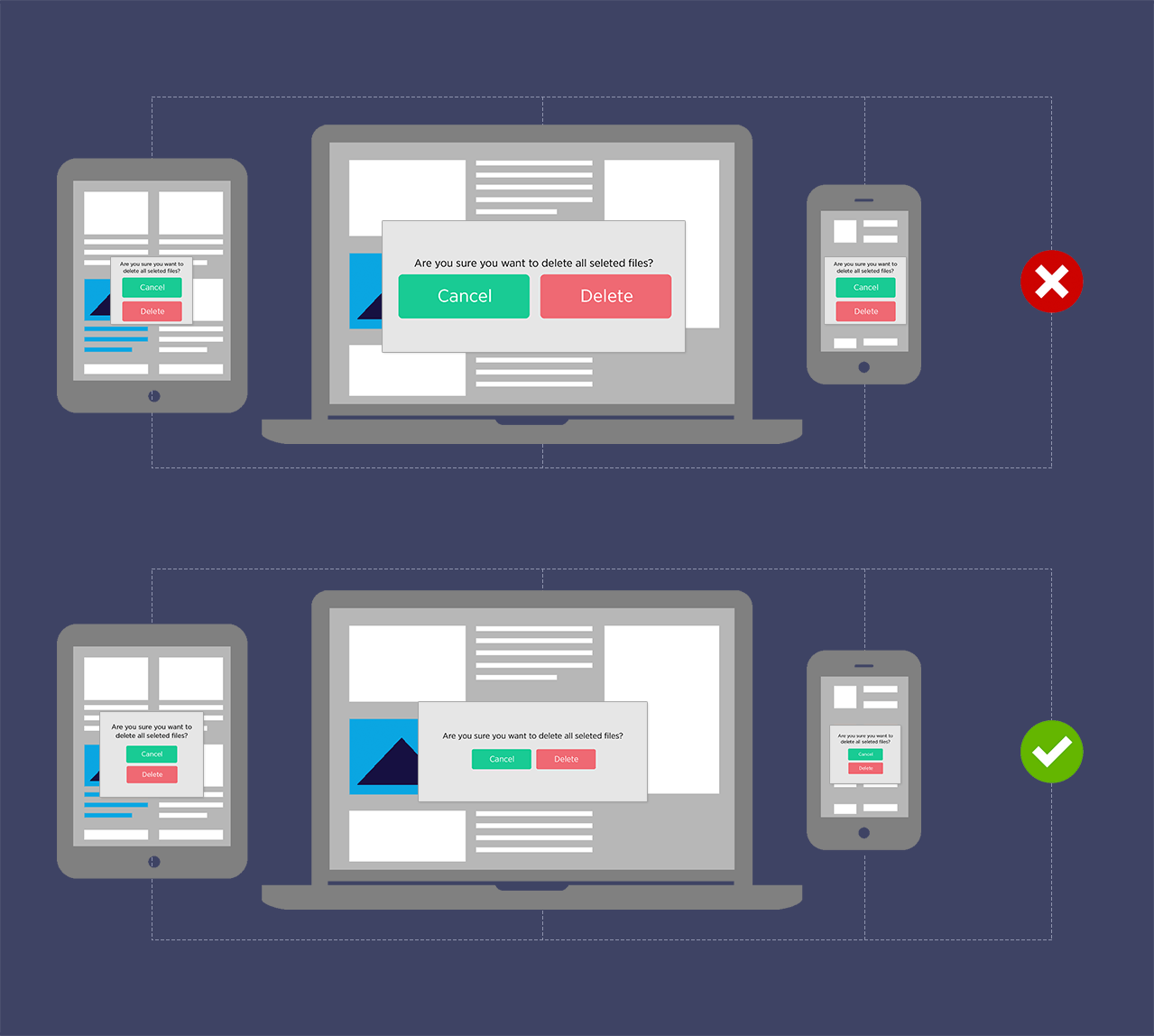
7. Size of Buttons
A very significant point to remember in button design is that the size of the buttons should be according to the screen, whether designing for a mobile phone or whether it is web button design. The button should be neither too large nor too small. It should be just the right size!!
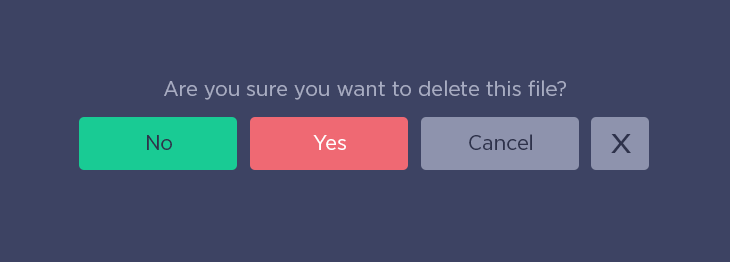
8. Avoid Using Too Many Buttons
A designer must prioritize the most important actions and make limited buttons. Too many buttons and actions on the screen will ultimately lead to zero action. Presence of too many buttons also confuses the user.
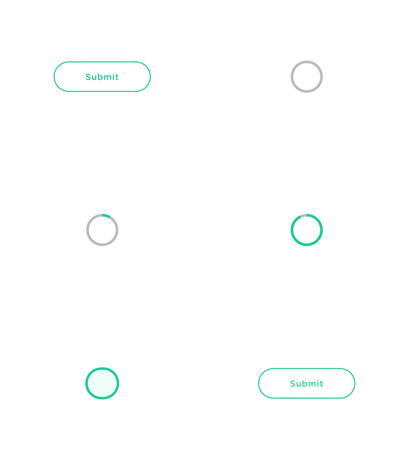
9. Provide Visual or Audio Feedback on Interaction
The UI should respond to the users’ action on a button. If a user clicks on some button, the UI, based on the appropriateness must respond audio or visually. This will ensure proper feedback as well as completion of the action.
10. Apply Contrasting Colors
A button should be identifiable and should not merge with the background. The color should be balanced, it should neither be too bright nor too dull.
Have you ever accidentally clicked on a wrong button?!
Users tend to make wrong decisions when they do not know what to do. So it is important to guide the users in the right direction. Some models prompt the users to act without making anything clear.
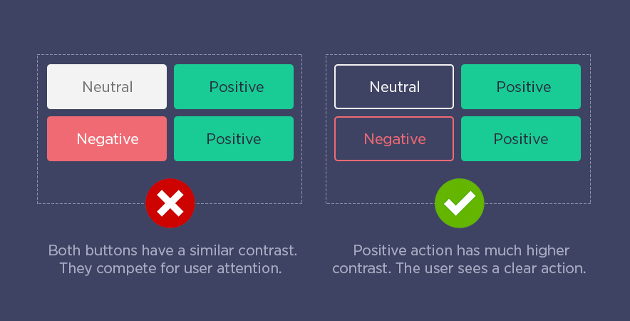
The clear color contrast between different buttons is what guides users to choose the right one. If the user is not able to spot the action clearly, his task slows down. It also sometimes leads to the selection of wrong actions which ruins their task. So, find just the appropriate color for your buttons!
Positive, Neutral and Negative Actions
There are three types of actions that every button falls under:
- Positive – This button enables to make changes, send or add information.
- Neutral – This button makes no change as such, it takes users back a screen (e.g. Cancel).
- Negative – This button helps to delete, reset or block information.
The Psychology of Colors
Find the appropriate color for your buttons and make them more useful and effective:
- Red: Power, passion, love, (negative);
- Green:Growth, money, environment (positive);
- Blue: Trust, peace, loyalty, safety, (positive);
- Black: Formality, luxury, sophistication, (neutral);
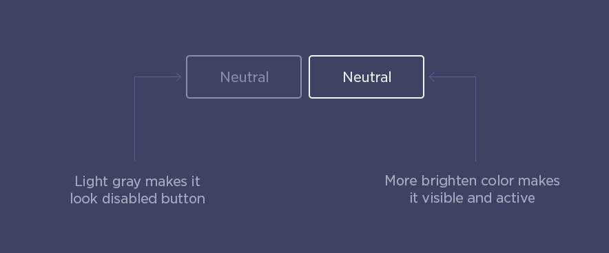
- Grey: disabled;
- Brown: Outdoors, food, earth;
- Orange: Confidence, cheerfulness, friendliness;
- Purple: Royalty, mystery, spirituality;
Positive Actions Need the Highest Contrast
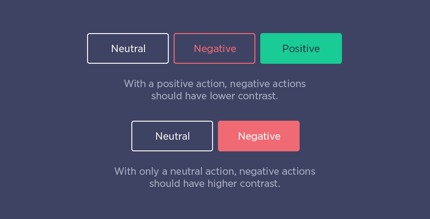
When Negative Actions Have Highest Contrast
Neutral Actions Have the Lowest Contrast
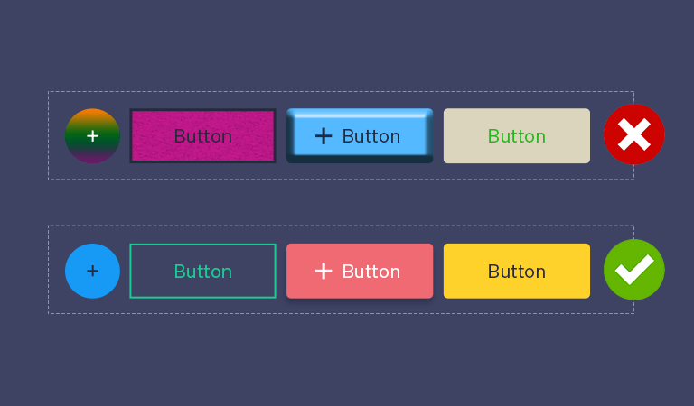
11. A Thumb Rule – Just Keep it Simple
A button shouldn’t look too busy and one shouldn’t overdo a button. It is always good to have some sort of similarity between the buttons on a single UI. Too complicated buttons are heavy and they do not look good. The more simple, the better it looks!
Dos and Don’ts of Button Design
| DOs | DON’Ts |
| Make buttons look like buttons. | Do not label buttons randomly. |
| Label buttons exactly what they do for users. | Do not put buttons where the users can’t find them. |
| The users should be able to interact with the buttons easily. | Do not make buttons of the same UI differently. |
| Follow uniformity and consistency while Button Design for a single UI. | Don’t put too many buttons on one page. |
| Place buttons where users can find them easily or expect them to be. | Ambiguous button labels and placement leads to delayed actions and so they should be avoided. |
| Put buttons in a correct order. | Do not use images as buttons. |
| Make the important button look like it is important. | If there is no requirement as such, do not put buttons unnecessarily. |
Button Design Inspirations
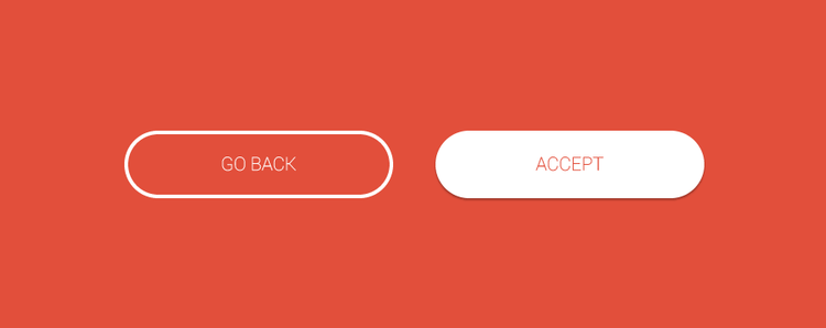
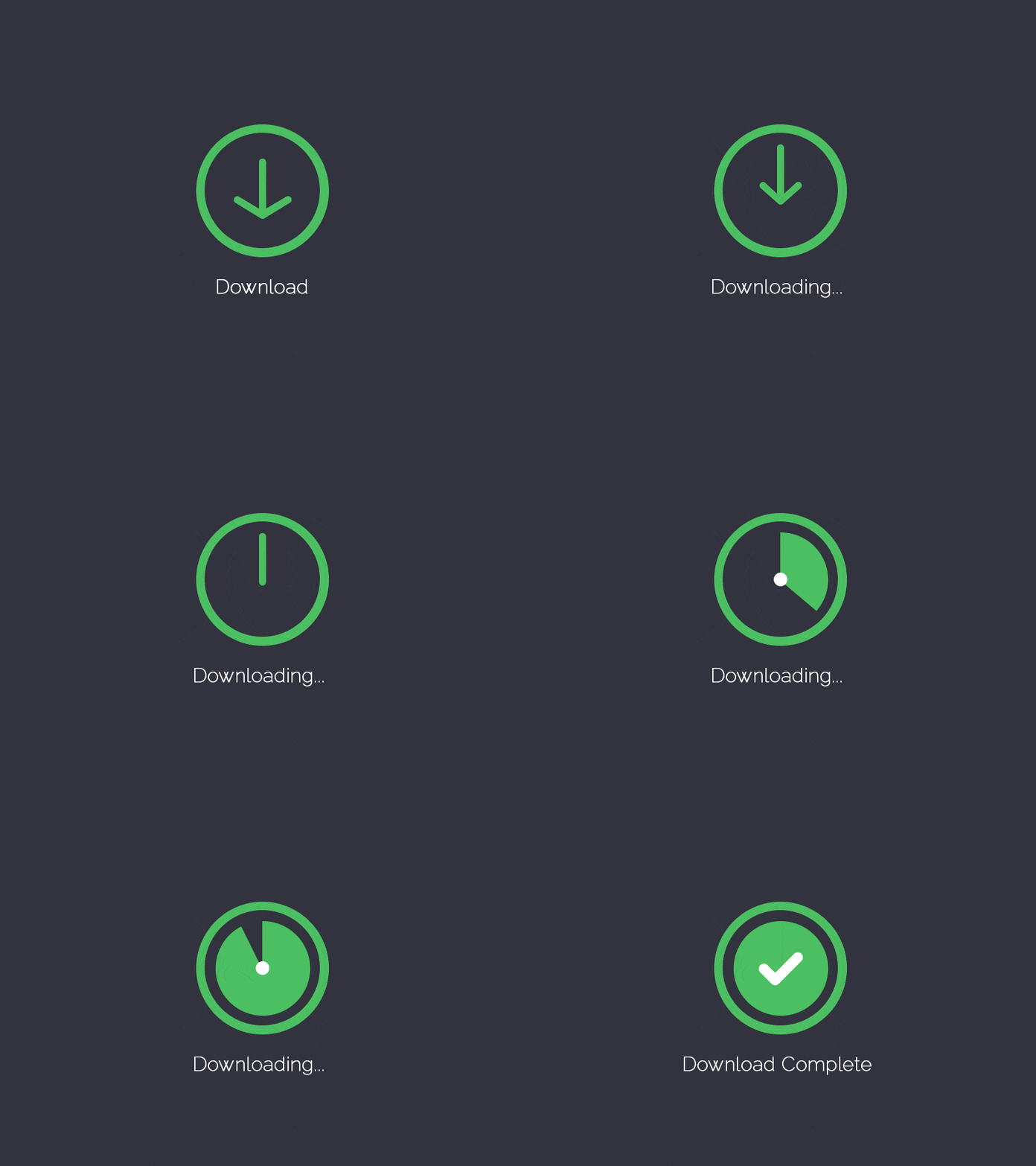
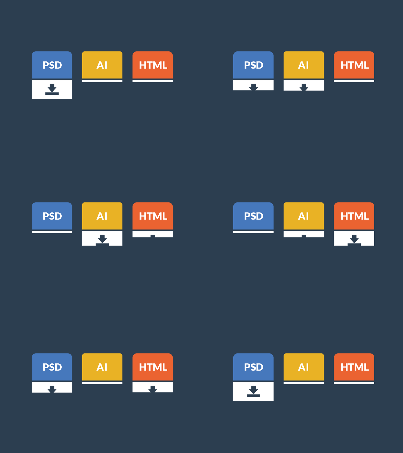
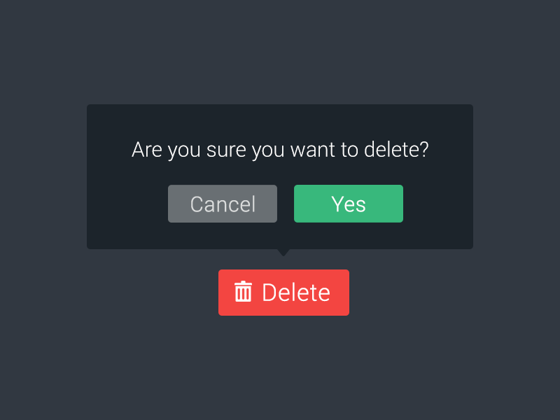
Some cool examples of Button designs
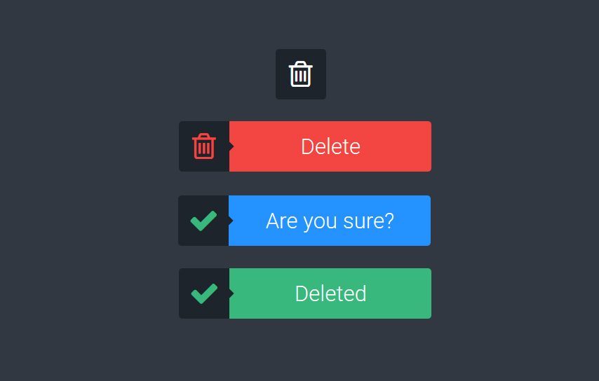
CSS Button Hover Examples From CodePen
Five Different CSS Button Hover Effects
Designed by Magda
Three Simple CSS Button Hover Effects
Designed by Dronca Raul
Layered Button Hover Effects
Designed by Dronca Raul
Ghost Button Animation
Designed by Valentine
Amy Winehouse Doc Button Design
Designed by Eric Grucza
Collection of Button Hover Effects
Designed by David Conner
Cool Beans Button 60fps
Designed by BROWNERD
Half Fuller Buttons
Designed by David Fuller
Contact Button Hover Effect
Designed by Alberto Jerez
Button Bubble Effect
Designed by Adrien Grsmto
Conclusion
Buttons are a very significant part of a smooth user experience. It is thus, important to take care of the essentials of a button design. As designers, when you design your own buttons we recommend you to start with the buttons that you think are the most important. Follow your heart and mind while designing a button. Don’t stop until you are satisfied with your creation. More practice in web button designs will lead your way to perfection for sure. And whatever you are designing, always keep recognition and clarity as your prime objectives.
We hope that this post on Button Design is helpful for you. Do share with us your views and ideas on web button design. Comment below to let us know which one is your favorite button design inspiration and also, let us know your button design ideas.

