GOOGLE HAS A NEW LOGO THAT DITCHES THE OLD SERIF LOOK, AND REACTS TO YOU IN ALL CONTEXTS.
![]()
You will very soon notice that Google has a new logo that’s sleeker, brighter, and for the first time, animated. And then, you probably won’t notice it at all.
It’s been a long time since the Google we know has just been a logo sitting on top of a search bar. The company makes whole operating systems for laptops, phones, watches, and smart home products. They’re building cars that don’t need you to drive them. And even search is a lot more complex than it once was. Google doesn’t just find you a link anymore, it responds to your voice, maps you to a restaurant based upon your context, and then, if you like, uses underlying intelligence to predicatively plan every other moment of your day. Google went from being the way we find trivia to becoming the digital infrastructure of our lives.
And in turn, they’ve created a new logo and brand identity, out today.
![]()
The New, Scalable Typeface
The most immediate change is the typeface of the logo itself. Since 1999, Google has used a serif wordmark (serifs are the filigree on the ends of traditional print typefaces like Times New Roman). Along the way, the company has tweaked letter spacing and removed the drop shadow, but other than that, the Google logo of 2015 is the same as it was in the last millennium: like the name of an encyclopedia printed in childlike basic colors.
![]()
Now, Google has updated the logo with a sans-serif typeface (think Helvetica) that’s actually Google’s own creation. Called Product Sans, we got a first peek of it in the company’s Alphabet logo, and at a glance, it undoubtedly looks more modern than the old alternative. But sans-serif typefaces are popular on these days for another reason than some attempt at dot com cool: their streamlined glyphs shrink down to tiny sizes with more legibility than the more ornamental serif lettering. And so Google has created a logo that can read as well on a 2.5-inch Android Wear watch face as it does your 50-inch TV playing Chromecast.
Of course, in some contexts, even the smallest version of six whole letters is too much to fit. So Google also introduced an abridged “G” logo, itself rendered in the four colors of the full Google logo, for the tightest of spots.
An Animated Life
The greater update, however, is that Google’s logo is no longer a static wordmark. Like many brands, they’ve shifted from a paper-first, static logo to a dynamic, animated figure that’s only possible on screens. When Google is called to action, the letters of “Google” transform into a series of four dots that morph and orbit with life.
![]()
So as you begin a voice search, the Google logo will morph from “Google” into the dots, which undulate like water in anticipation of your query. As you talk, the dots will become an equalizer, reacting to the sound of your vocalizations. Then when you’re done talking, the waveform become dots again, which spin as Google looks up your results. Then once the results are presented, the dots return to good old “Google” again.
It’d be easy to pigeonhole this animated flourish as nothing more than Google’s ongoing quest for beautification. But in reality, the animations serve as a way for Google to hold the hand of the user through varying, complicated workflows. Take the aforementioned voice search: whether its the tranquil waves that seem to be waiting for action, or the spinning dots that convey “things are happening! even if you don’t know what they are,” each animation serves to prompt or reinforce user behavior in an era when Google will move from the relatively simple interactions behind search to more varied and complicated mediums (remember Google is building a self-driving car). And, if nothing else, a bit of animation shows that Google hasn’t fallen asleep at the wheel.
It’s Google
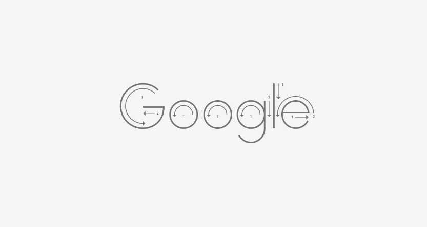
As the company introduced its new identity, Google did something that’s pretty rare in the world of branding. In one behind-the-scenes photo, they revealed a few alternatives that had also been considered. In most cases, you can see that designers felt the wider, circular-G was the way to go. One version was “google” in lowercase. Another had eight small dots rather than four. And several explorations played off of the pure manipulation of very basic geometry. (They drew every letter of Google with nothing more than circles and semicircles—save for that pesky “l”.)
What they decided on isn’t groundbreaking—no creative directors will be scrambling to update their brands—but it’s tasteful, flexible, and most importantly, very much Google. Like any new logo, Google’s latest creation will look odd for the first minute or so. But all you have to do is go back and look at the old—OK, yesterday’s—sans serif logo to see, yeah, it really was time for an update.
And if that doesn’t work, head to Google.com and repeat the process another 40 times today. And then do it again tomorrow…and the next day…and the next…
Source : FastCompany
![]()
The design strategy behind the Google Logo
Source : design google
Related Article : the evolution of top famous companies like google, apple and more