Mozilla is all set to launch a new design system. With all the technological and digital advancements happening people will need newer tools to benefit from them the most. The officials explained that their original logo of a fast fox which depicts speed and power does not depict the power and worth of their entire product range. Thus, they are planning to redesign their old foxy logo.
“Firefox is creating new types of browsers and a range of new apps and services with the internet as the platform,” as written by Enros and Murray. Madhava Enros, Sr. Director, Firefox User Experience and Tim Murray, Creative Director announced this on their blog.
“With your input, we’ll have a final system that will make a Firefox product recognizable out in the world even if a fox is nowhere in sight.” The team is taking a poll on whether the audiences and users like the foxy logo or the fox’s back in the logo. Mozilla asks its users to provide their feedback in the comments section of their blog post. Even though they clearly mention that these designs are proposed designs and nothing is finalized as of now. But they are still taking a poll to keep their audiences involved in their decision of changing their firey foxy logo.
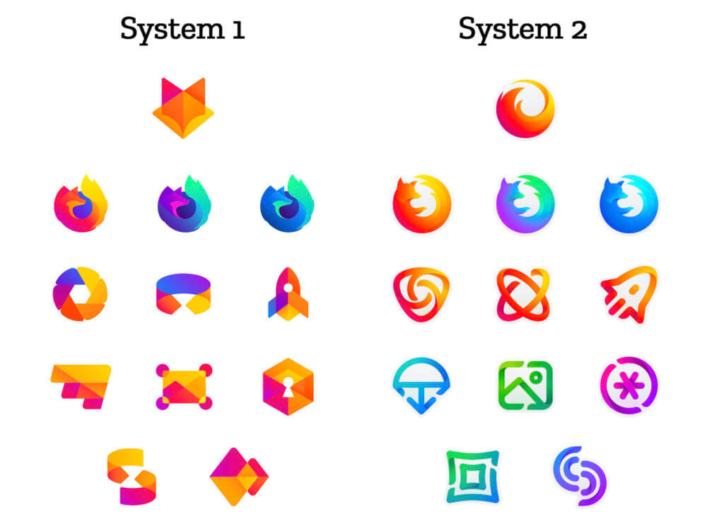
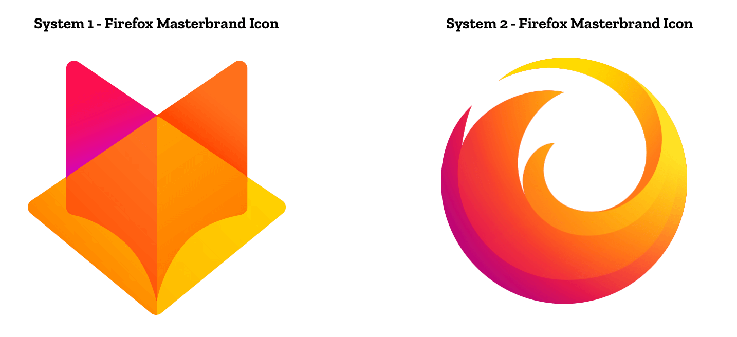
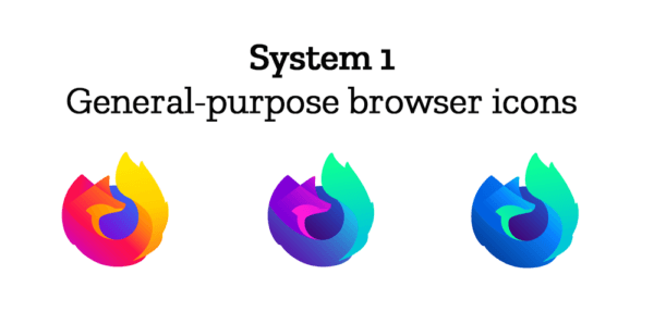
Below are the designs of the two system approaches that team Mozilla has proposed.
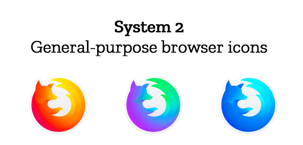
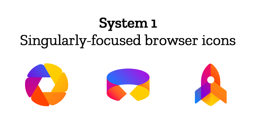
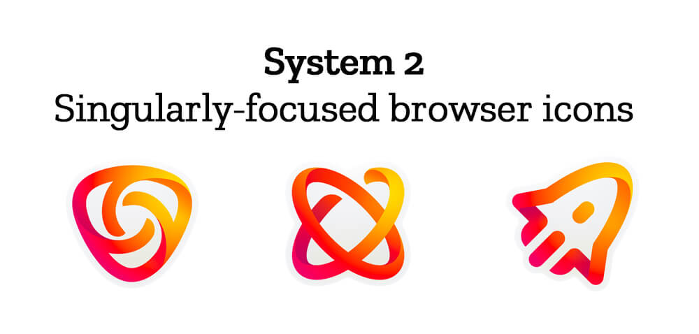
![]()
![]()
We just have one wish for Mozilla: stay foxy.
Today, we’re sharing our two design system approaches to ask for your feedback.
Via: Mozilla blog | Mashable
[zombify_post]
Conclusion
Whatever will be the final decision, we just hope that Mozilla sets fire with revamping its logo. We, however, like the fiery fox, as they say- old os gold.
P.S. This poll is solely for CGfrog and has nothing to do with the Mozilla poll. We just wish to know our Frogians’ opinion.


