Don’t feel bad all the designers make mistakes not only you. Here are the most common, and how to avoid them. Almost all designers out there committed them at least once in their careers. Let us see what mistakes you should not do. We have previously hosted an article: 20 Common Mistakes Graphic Designers Make.
1. Failing to Understand the Brief

Without a clear idea of what the client wants is the most common mistake. Sometimes, the client, trying to be helpful, adds a lot of explanations, and examples that make things worse. Never take for granted the fact that you are pretty sure you know what the client means.
The best solution for avoiding this mistake is to talk to the client, constantly communicate, and ask for feedback and references. Make notes, and screenshots carefully from the start. Create a draft mock-up of your general idea for the design and send it to the client, the client will tell you if this is what he has in mind or not. As you progress with your work, make sure you get feedback for every single stage of the design project.
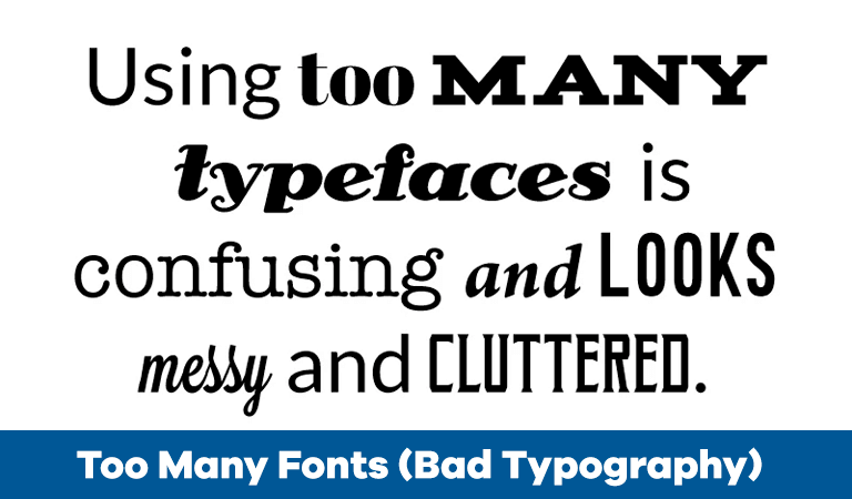
2. Too Many Fonts (Bad Typography)

Non-designers also tend to overdo it by combining too many fonts. This tends to give the design a disorganized and unprofessional look. Read this: 18 Rules for Using (fonts) Text for Designing, also read Serif vs Sans Serif – The Final Battle.
3. Using Too Many Stock Photos

There is no doubt Stock images can be very helpful to a designer, especially when you can’t afford to hire a professional photographer. But over-abusing royalty-free images will make your work look sloppy. Try to avoid using stock model images, May your design client complain that he did not get value for his money.
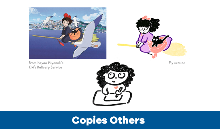
4. Copies Others

This is the biggest designer mistake of all and, unfortunately, is becoming more and more common. Copying others does no one any favours, neither the client nor the designer, you risk your design crime being made embarrassingly public. Keep your credibility and keep your work authentic.
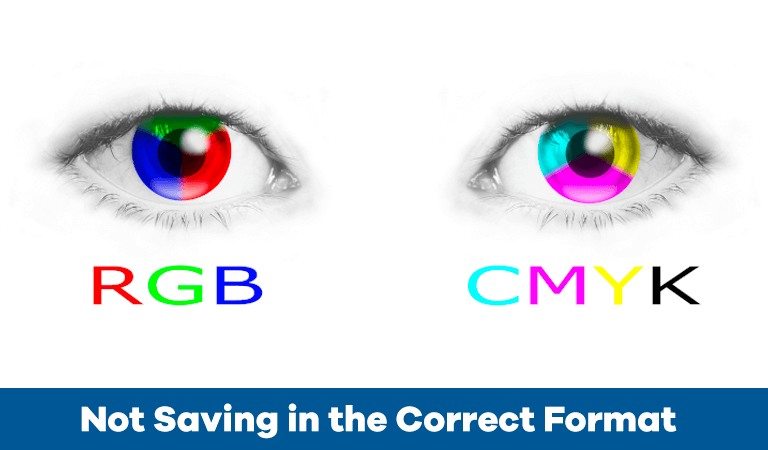
5. Not Saving in the Correct Format

We will be brief on this: CMYK for print and RGB for the web. Always. No exceptions. Plus, remember issues such as bleed, trim, and safety areas when you design for print.
Now, this being said, we hope that your work will get to higher quality standards and we are looking forward to hearing how you overcame other issues regarding clients’ demands, graphics mistakes, and logo redesigns. Read this: Know Your File Types: When to use JPEG, GIF & PNG also read: The Best Tricks to Reduce File Size Without Quality Loss in Photoshop CC


