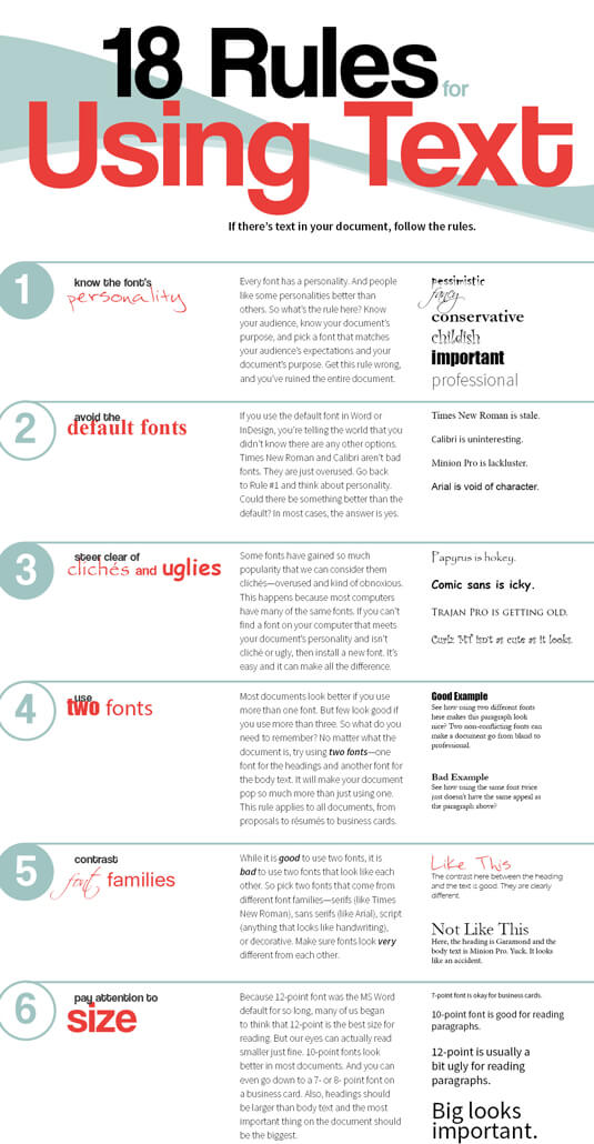
Either you’re a graphic designer or web designer, the use of typography can be confusing : which font do you choose, and what size? If you are building a campaigns, writing a ebooks, design a magazine, creating infographics or if there’s text in your design, follow the rules in this infographic and you won’t go wrong. follow these simple rules and take notes for the next time you have to prepare something you want people to read.
We have visited The Visual Communication Guy and found one of the best infographics we have seen that provides designers with 18 rules for using text for designing – so we had to share it with you. Hope you will follow these simple 18 rules and quickly start to see a world of difference in your designs. also check Serif vs Sans Serif – The Final Battle.
Click to view full enlarged version
[quads id=”1″]

To purchase a 20×30 printed poster version of this infographic, please visit the online store.


